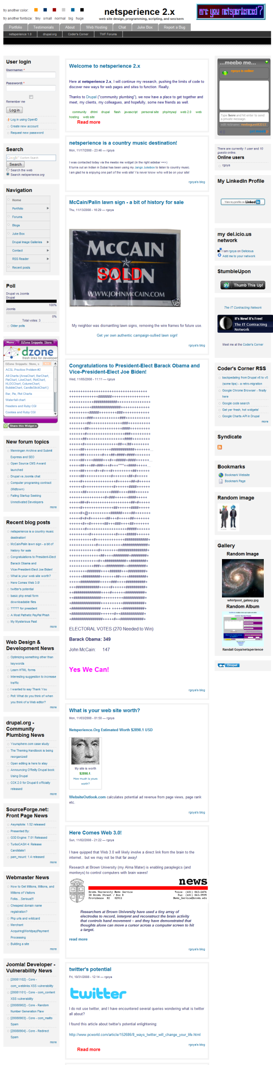
critique "netsperience 2.x"

LINK: netsperience 2.x
netsperience 2.x is my "personal" site, my blog, with web development resources and news, and my portfolio - I generally link directly to the portfolio for potential clients or employers, also About and Testimonials

I plan to develop role-specific content and areas for "clients" and "colleagues" but I have not worked on that beyond some taxonomy sorting.
The site is a perennial work-in-progress.
I am not a "designer" - I am using a modified version of the Drupal Four Seasons theme.
Anyway, I am very close to it, and curious about others' comments with more perspective.
I have also maintained a netsperience 1.0 site on GeoCities Free for over 10 years...
| Attachment | Size |
|---|---|
| netsperience.png | 555.29 KB |
pr0gr4mm3r posted this at 20:42 — 30th November 2008.
He has: 1,502 posts
Joined: Sep 2006
I don't think it's necessary to have the color and font preferences at top, especially activated by only a rollover. Your website is like your brand, and you want people to recognize it by it's layout, colors, etc.
TWF Forums translates to The Webmaster Forums Forums
The meebo widget is nice, but I'm not so sure it's best to have it on every page because it takes a couple seconds to connect, and the sessions aren't carried over from page to page anyway. I tested it on my own site, and when I reload the page or go to another one and send another message, it comes up in a new chat session. You may have seen my ID up on your list if you were watching it over the last couple minutes.
There were a couple layout issues, of which I will attach.
I was reaching for the Home tab a couple of times only to find it wasn't there. I know clicking your logo goes there, but I think a home tab would help.
I don't think it the best idea to set up a forum unless you are convinced that you can have regulars posting there consistently. Otherwise, it just makes the site look like a ghost town. Sticking with the blog approach is best in my opinion until you get posts where you get tons of comments and regulars posting on almost every one. Once you start to get good discussions in your blog posts, it could be time to launch a forum.
Other than that, it looks nice. News feeds on the side is good to have for consistent new content.
Again about the colors & font size, I probably changed that a dozen times because I move the mouse up in that direction to tab between this thread & your site.
decibel.places posted this at 23:17 — 30th November 2008.
He has: 1,494 posts
Joined: Jun 2008
pr0gr4mm3r,
I appreciate the in-depth comments, thank you.
I changed the controls to rollovers, on purpose. They are part of the Four Seasons theme, which I customized. My quirkiness, it's my site and I can do what I want.
Or my brand is an unusual front-end with customizable views - sort of a Drupal thing...
True, but TW Forums looks funny... and plain TWF is too abscure...
Yeah, I removed it from my admin pages for that reason. I actually get contacted through it, sometimes the first contact with a new client comes through it by IM...
No, didn't notice, but if you pinged me I would have replied...
Forums are not really developed, and as you noted, not very busy. I am thinking of removing the ecard feature or only enabling it for specific nodes. What is wrong with the search?
Thank you! That is one of my frequent comments on other sites, but on my own I never noticed...
Well, I get pretty steady traffic, a few hundred hits per day, without much promotion. I'd like to develop the forums into a community feature, but that would be part of further development. Maybe I'll turn them off for now...
Thank you. I actually put the feeds there for my own use.
Right, I noticed it is easy to mess up the view, I should separate the controls from the menu more... or more likely change them back to clickable controls...
PS
pr0gr4mm3r: Are you sure you wouldn't like one of the McCain/Palin lawn signs gratis? I sold 2 of them on eBay so far...
teammatt3 posted this at 23:42 — 30th November 2008.
He has: 2,102 posts
Joined: Sep 2003
It extends off the block in Firefox on linux (it's not just pr0g, I see it too).
I too don't like the style change on hover. If someone unexpectedly runs their mouse up there, everything changes. Probably more annoying than useful.
Is there any reason you don't want the portfolio to open in the normal window? I don't really see the need for a popup, and it looks really strange when you come to a plain white page with "If Portfolio Window...". Maybe on the onclick event of the Portfolio tab you could do a popup and redirect the main window. Most popup blockers will allow that type of popup (as opposed to an onload popup).
cmoyer posted this at 01:16 — 1st December 2008.
He has: 131 posts
Joined: Jun 2008
The font/color changing on hover is a little bit annoying, especially if you use a track pad and bump it when you type or when you try to get to another web browser tab.
On the left-hand column the Nav should show up before the login and the google search (I would put it at the top -then login then - google search.
To tell you the truth I think the site has too many blocks on it, It makes the design cluttered and look messy. (the gallery, random image, dzone, keyword typo generator, speed test, and random album blocks could go and free up a bunch of space as well as quicken your site's loading time.
It took me 50 seconds to load the home page! At about 500kbps (using your speed tester) Even though the size of the d/l was about 315kb. 95 requests is also in my thinking way too many. I am on a dsl modem on a fairly new computer too and it still takes 50 seconds, I'd hate to see how long it would have taken on dial-up!
On a reload it took 16 sec with 95 requests and a total of 235kb.
The pop-up for the portfolio is out of place and looks unprofessional, as well as not fitting the site.
I also feel that there are too many posts on the home page if you limited it to a simple home page or even about 5 recent posts that would be good, but 10 is too many.
The logo looks slightly out of place on the site, but if you are preserving the history from 1997 then that's fine.
To solve your TWF Forums you could have TWForums which looks decent and has what you want without a repeat (even though I have no problem with it either way stated above)
Needless to say if I were a less patient person I would have left the site before it loaded the first time. Fix that and some of the other things and you will have a good site.
decibel.places posted this at 04:48 — 1st December 2008.
He has: 1,494 posts
Joined: Jun 2008
Thanks for all the comments, pretty much stuff I had a hunch about, good to get feedback
I like the portfolio the way it is
1. The color and font changers are now onclick
2. I dropped a few blocks
3. I shortened the number of posts
4. got rid of the ecard, when people got it they didn't understand, there are better more general tell a friend modules
5. Keeping meebome, even though that is usually what slows the pageload - just got contacted with it again
6. I set an explicit width for the search input
7. currently hosting it at BlueHost with about 1700 IP neighbors - plan to move to my Hot Drupal acct with 65 neighbors...
webwiz posted this at 06:14 — 2nd December 2008.
He has: 629 posts
Joined: May 2007
To address the problem of slow page load, check out the Firefox/Firebug add-on "Yslow"[1]. Hint - click the messages to get information on how to fix the problems.
[1] http://developer.yahoo.com/yslow/
P.S. A trip to the validator might be in order ...
Cordially, David
--
delete from internet where user_agent="MSIE" and version < 8;
decibel.places posted this at 14:38 — 2nd December 2008.
He has: 1,494 posts
Joined: Jun 2008
I use a lot of plug-in widgets, which make it slower.
significant speed will be gained when I turn on the Drupal performance caching features.
I don't care too much about validation (for my own site), as long as it doesn't break
I have Yslow - here is the report:
cmoyer posted this at 14:52 — 2nd December 2008.
He has: 131 posts
Joined: Jun 2008
The page load is much Much better now, I wonder if our DSL was being slow the other day...
Now if the user was on a 50k connection it would take about 5 secondes but our dsl gave me 13.5 so that would probably make dial up take about 20 sec.
Once you get the drupal cache enabled it should speed up even more.
That is much better from the 50 secs on dsl!
According to the w3 validators you have 5 css errors and 99 html errors!
(most of the html errors are style properties and the css just dosn't have the : between the selector and the property)
decibel.places posted this at 16:15 — 2nd December 2008.
He has: 1,494 posts
Joined: Jun 2008
Thanks for the analysis, cmoyer
It is also hosted on a shared account at BlueHost which is generally ok, but occasionally slow - planning to move it to Hot Drupal soon
I think most of those errors are from plugin widgets - Drupal usually produces valid code - I'm not too concerned about validation (for my personal site) as long as it works...
Plazza posted this at 11:09 — 14th December 2008.
They have: 5 posts
Joined: Dec 2008
Your site loads quickly, the mix of colors is very professional. The navigation is very easy to understand. I think its a very good site. By the way I liked the video about the dog called Faith It blew my mind away that's the first time I have seen a dog walk on two legs. Keep it up. Its a great site.
________________________________________
Mining is What I Do
I Offer Mine Jobs
________________________________________
Want to join the discussion? Create an account or log in if you already have one. Joining is fast, free and painless! We’ll even whisk you back here when you’ve finished.